
 Paint schemes—they’re literally the most-visible part of a racing team. We’ve seen some good ones over the years, from the simple and iconic to the wild and unique. That got me thinking—what are the greatest paint schemes of all-time? Well, to avoid making this a fifty-part series, I had to limit it a bit with two rules:
1.) Paint schemes must be from 1993 onward
2.) Paint schemes must have been run for the majority of the season in question
Also, there are two main considerations taken into account when coming up with this list:
1.) How good does the paint scheme look?
2.) How memorable was it?
Furthermore, variations were taken out of the equation—only one paint scheme per driver was included on this list.
And now, without further ado, here they are—the Top 10 Cup Series Paint Schemes Since 1993 (PART 2)
 |
| 5. A new look that worked |
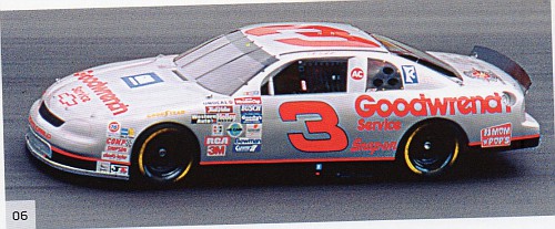
5. Bobby Hamilton STP Silver Anniversary. Some paint schemes can seem like prisoners to the past—Dale Earnhardt Sr.’s black GM Goodwrench look, for instance, stayed virtually identical through the years. Others, like Richard Petty’s STP red-and-Petty-blue scheme, changed year-to-year to the point where its difficult to call any one of them “iconic”. But one notable exception was when the 43 team ran a silver anniversary paint scheme to honor STP’s 25th year sponsoring Petty Enterprises. The perfect example of how a refresh can make the old look new while still remaining familiar, the only downside was that this look only ran for about 2/3rds of the races in 1996 before never being seen again.
 |
| Only ran once (well, twice if you count the throwback) |
Why this scheme over…: any other STP scheme? As I said above, no one year’s scheme really stands out above the rest. I guess you could say the last look Richard Petty had (during his “Fan Appreciation Tour”, but that came a year before the purview of this list. However, if this was a list of the WORST paint schemes of the past 25 years, we could fill up most of the list with Petty Enterprises Cheerios cars.
But what about…: any other silver car? Well, unfortunately the best of them (Dale Sr.’s Winston anniversary car and Terry Labonte’s Ironman schemes) were only run for a race or two each.
 |
| 4. Bright, bold, and fast |
4. Kyle Busch 2018 Yellow M&M’s. Let’s be honest here—almost any M&M’s paint scheme, going way back to the Ernie Irvan days, looks great. The colors pop, the characters are a nice touch, and its extremely easy to see who the sponsor is from far away. Picking just one is a difficult task, but for me, 2018 is the best so far. The use of the classic yellow base color a nice touch, while the rainbow lineup of M&M’s on the back of the roof is a great innovation.
 |
| They should've run it! |
Why this scheme over…: a MB2
or RYR M&M’s scheme? Really, it all comes down to number style—the biggest variant amongst the numerous yellow looks over the years for this sponsor. The “painted on” look of the 36 and Elliott Sadler-era 38 always seemed cheesy to me. And while the David Gilliland-era block 38 was a marked improvement, the single “M” candy on the hood was a detriment.
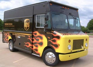
But what about…: the UPS car? Just kidding—the UPS brown-and-white is just about as far from the colorful M&M’s as you can get. Besides, Dale should’ve run the truck. People love the truck.
 |
| 3. Taste the rainbow |
3. Derrike Cope/Ernie Irvan 36 Skittles: In the pantheon of candy, fruity Skittles always comes up short against its corporate cousin, chocolatey M&M’s—except here. Taking the idea of a rainbow car and turning it on its ear, we got the perfect interplay of bright and deep colors, never obscuring the sponsor’s name or the number on the car. Also notice the little touches like black lines between each color and the forward-sloping number. Near perfection in paint—too bad that on the track the car, well, sucked.
 |
| "No--make the 5 bigger!" |
Why this scheme over…: another rainbow “knockoff”? Look, I’m aware that the Skittles car was likely an attempt to sponge off the notoriety of Jeff Gordon’s “Rainbow Warriors” look, but this car just looks so much better than any other imitator. Want to see a copy that looks worse than the original? Check out Kyle Petty’s 1996 Coors Light car.
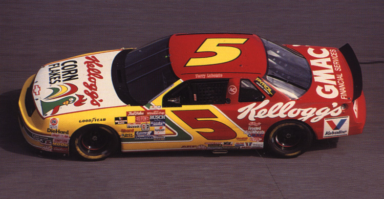
But what about…: Terry Labonte’s Kellogg’s Corn Flakes cars? Texas Terry had some great, colorful looks in the 5 car, particularly with Kellogg’s as the sponsor. Unfortunately they tended to look either slightly too staid (the regular scheme) or way too crazy (almost any special paint scheme).
 |
| 2. Iconic |
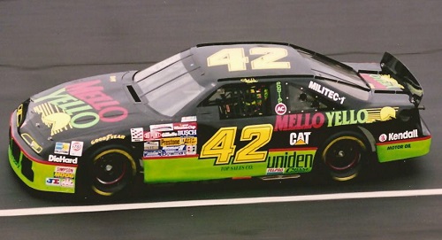
2. Kyle Petty Mello Yello. Its tough to find a more-iconic paint scheme than the Mello Yello look of the 1990’s. Whether it was the real-life Kyle Petty scheme or its Hollywood inspiration from Days of Thunder, the day-glo colors seemed to jump off the glossy black paint. Combining neon green, bright yellow, and a nearly-orange red, it was about as close to perfection as you could get.
 |
| Nearly forgotten |
Why this scheme over…: Bill Elliott’s McDonalds scheme? Another combination of bright (yellow) and deep (red) were most of Bill Elliott’s McDonalds looks. However, there were two things working against it—no one scheme really stood out amongst the others (a little white—no, no, lots of white—no, wait, NOOO white at all!), and the red car paired with yellow and white seemed to blend in with far too many other cars.
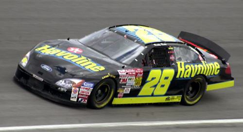
But what about…: Ricky Rudd’s non-Texaco Havoline scheme? This nearly-forgotten paint scheme combined many of the same attributes as Kyle’s car did, but unfortunately seemed to leave little impression upon most fans.
 |
| 1. The best |
1. Dale Jarrett’s first Ford Quality Care car. In my opinion, this is the gold standard amongst modern paint schemes. A perfect color scheme (hard to argue against the stars and stripes). A beautiful design that rides the razor’s edge between understated and busy. The clever way of working in the Texaco associate sponsor logo. Even the bubbly number style works well here. There’s lots of great paint schemes through the years, but this one is great on all fronts.
 |
| ...until next time |
Why this scheme over…: later Ford Quality Car schemes? Two small changes happened the next year that were slight—but noticeable—downgrades—the loss of the “Red Carpet Lease” lettering on the quarter panels, as well as the cluttering of the “stripes” part of the design with more associate sponsor decals.
But what about…: the special paint schemes from the first race after 9/11? Well, those were beautifully patriotic—but they were special paint schemes, only for a single race. Maybe they’re for a different list for a different time.