
 Paint schemes—they’re literally the most-visible part of a racing team. We’ve seen some good ones over the years, from the simple and iconic to the wild and unique. That got me thinking—what are the greatest paint schemes of all-time? Well, to avoid making this a fifty-part series, I had to limit it a bit with two rules:
1.) Paint schemes must be from 1993 onward
2.) Paint schemes must have been run for the majority of the season in question
Also, there are two main considerations taken into account when coming up with this list:
1.) How good does the paint scheme look?
2.) How memorable was it?
Furthermore, variations were taken out of the equation—only one paint scheme per driver was included on this list.
And now, without further ado, here they are—the Top 10 Cup Series Paint Schemes Since 1993 (PART 1)!
 |
| 10. An understated look that works |
10. Rusty Wallace Miller Genuine Draft. Sometimes less is more, as evidenced by this classic understated look Penske Racing South campaigned throughout the early-90’s. The combination of bright gold, black, and white works fantastic together, whether the car is dueling for the win at Bristol or flying through the air at a plate race.
 |
| Just a LITTLE too dull |
Why this scheme over…: the one year “Miller Beer” car? It was a decent attempt at a refresh, but looked far too busy compared to the original. Meanwhile, I always thought the white Miller Lite look Rusty ran for the last few years of his career looked drab.
But what about…: Dale Earnhardt’s GM Goodwrench car? Same philosophy as Rusty’s, but the white-on-black look always seemed, well, a bit boring to me. With that being said, the “PLUS” variation nearly beat out Rusty for this spot.
 |
| 9. The flames car was hot |
9. Jeff Gordon DuPont “Flames”. Jeff Gordon debuted in Cup with an iconic paint scheme, the DuPont “Rainbow”. But when it came time for a new look, Hendrick Motorsports upped their art game with the striking “Flames” car. Perhaps the best example of how to use a bunch of bright colors at once, variations on the template were used almost exclusively with other part-time sponsors (AARP, Nicorette, etc.) for the rest of his career.
 |
| This car somehow actually ran |
Why this scheme over…: the “Rainbow Warriors” look? Well, maybe I’m in the minority here, but I always thought the rainbow scheme was missing that certain “something”. Maybe it was the odd lack of the color red, or maybe it was too much neon, but I’ve always liked the “Flames” car better.
But what about…: any other neon car? Plenty of other cars used a mixture of bright neon colors, but the 24 team gets points for originality and the right amount of restraint (lest we forget the 23 car’s Smokin’ Joe’s monstrosity).
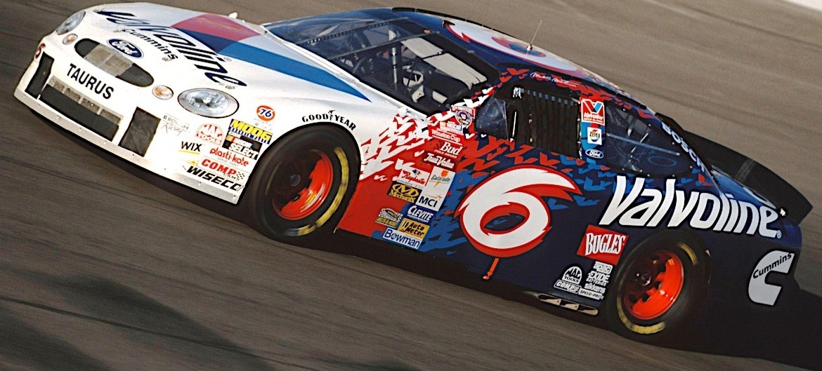 |
| 8. The Flying V's! |
8. Mark Martin Valvoline “Flying V’s”. Mark Martin was one of the top drivers in Nascar throughout the 90’s, but his Valvoline paint schemes left much to be desired…at first. In 1998 his car got a radical new refresh—keeping the red, white, and blue color scheme but replacing staid stripes with bold splashes of color. Upon closer inspection, the edges of the “splashes” were actually tiny little V’s, an awesome nod to Valvoline’s longtime logo. This truly was a refresh done right.
 |
| Meh, still better than Presley's Scooby Doo car |
Why this scheme over…: as stated above Mark’s other Valvoline schemes were pretty tame, and the odd-looking font for the car number didn’t help matters. The closest he got to something this adventurous would come late in his career with the garish Go Daddy 5 car.
But what about…: the Jasper 77 car ran a similar scheme with blue, red, and yellow, but pretty much anything run by this team was the definition of “unmemorable”. Heck, their hideous yellow car stands out more in most people’s memories.
 |
| 7. The best looking "Tide Ride" |
7. Ricky Craven Tide Ride. Tide had been involved in Nascar since the 80’s, but something always seemed to be missing. Strangely enough, that “something” turned out to be a simple touch—blue numbers. The “32” on the orange-and-white PPI car really popped and somehow seemed to make the day-glo orange paint seem even brighter. A number of drivers ran this scheme, but Ricky Craven gets the nod for memorability alone.
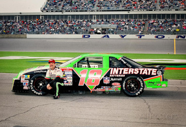 |
| One of MANY Interstate Batteries looks |
Why this scheme over…: any other Tide look? The Ricky Rudd-era cars always seemed a bit sedate thanks to white numbers and a somewhat jumbled look, and Darrell Waltrip’s inaugural scheme came before the time frame of this list.
But what about…: any Interstate Batteries look? Granted, Joe Gibbs Racing’s various Interstate Batteries paint schemes (especially in their early years) showed how to mix darks and neons. However, the lack of a consistent look over more than one season, combined with the sometimes arbitrary-seeming layouts, keep them off this list.
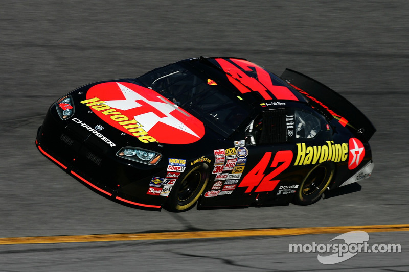 |
| 6. Controversy? |
6. Juan Pablo Montoya Texaco Havoline. And now we get to arguably the most-controversial entry here. Pretty much every Texaco Havoline scheme was beautiful—its hard to screw up red and black—so why does JPM make this list while Ernie Irvan or Ricky Rudd doesn’t? Its the numbers game—the football-style 28 on RYR’s Havoline cars always seemed a bit big and never really jumped out at you. Meanwhile, the 42 looked sharp and defined, while the Ganassi scheme also added the clever “with Techron” lifted-page decal. (Why yes, I *did* go to a college with red as a primary color, how’d you guess?)
 |
| One of the better of many choices |
Why this scheme over…: a Davey Allison scheme? Davey’s last Havoline look barely qualified for this list, coming in 1993, but again, lost out due to an inferior number style and a slightly-dull look. Admittedly, the first “Battlestar” scheme or the seldom-remembered black-and-gold looks could’ve made this list had they not come too early.
But what about…: a Ganassi Target paint scheme? Ironically the most-iconic of Chip Ganassi Racing’s paint schemes were the various Target-sponsored cars they campaigned—however, none of them really stand out from the others, and it could be argued that red-and-white is the most-overused color pairing in the sport.
COMING UP NEXT: PART 2